
Basic color theory for quilters
I have two friends who are color blind. “Green means go” doesn’t work for them. They “go” when the light at the bottom of the traffic signal shines bright. I take such delight in the brilliance of color that I cannot imagine not seeing crisp green leaves in spring or gorgeous red foliage in the fall! Colors spark memories, influence our buying habits, and inspire our imagination.
Humans can distinguish up to 10 million different colors. When you look at a swatch of fabric, cells in your eye called “cones” interpret the wavelengths of visible light and then send signals to your brain that translates into the color you see. Most humans have three types of cones that interpret photo pigments—red, green, and blue.
Interestingly, researchers also estimate that up to 12 percent of females have four cone types, giving them the potential to perceive 100 times more colors than anyone else. No wonder some quilters can create such astounding color combinations that the rest of us have never seen!
Even if you aren’t blessed with an extra cone in your eyes, all you need is a basic understanding of color theory to make quilts that will pack that “wow” punch.
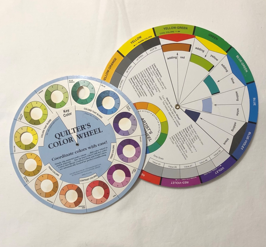
A color wheel is handy for learning how colors relate to each other, as well as learning color jargon. Though you may already intuitively select fabrics without knowing terms like “tint” and “value,” understanding the terms will help you figure out why a fabric in your quilt palette isn’t working as well as help you find a successful replacement.
Primary and secondary colors
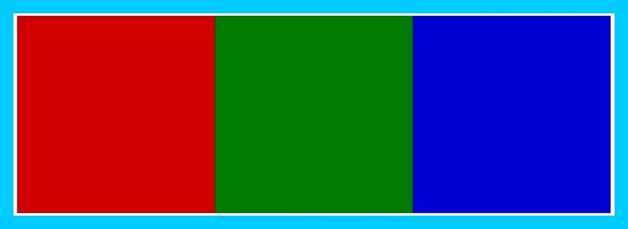
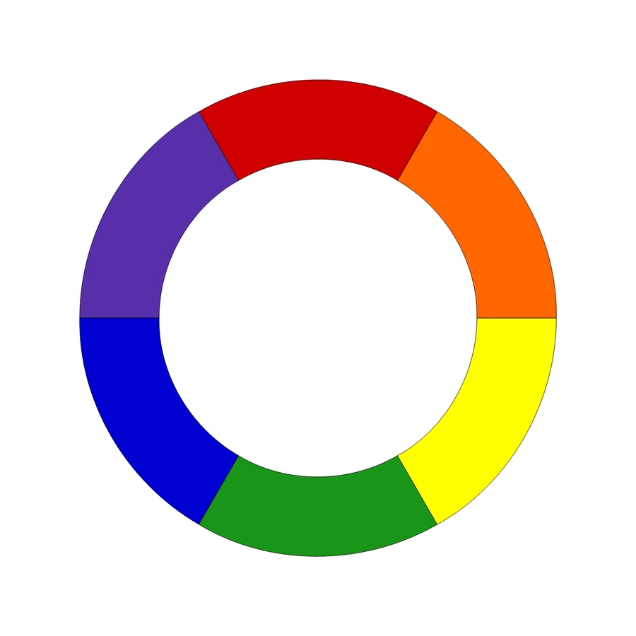
You learned about the primary colors in kindergarten—red, blue, and yellow. They’re placed on the color wheel to form an equilateral triangle. The millions of other colors are derived from mixing these primary colors together, along with adding black or white to varying degrees. The secondary colors of green, orange, and violet contain equal parts of the primary colors on each side of them. These six “pure colors” are the most powerful colors with the greatest visual impact.
Color value
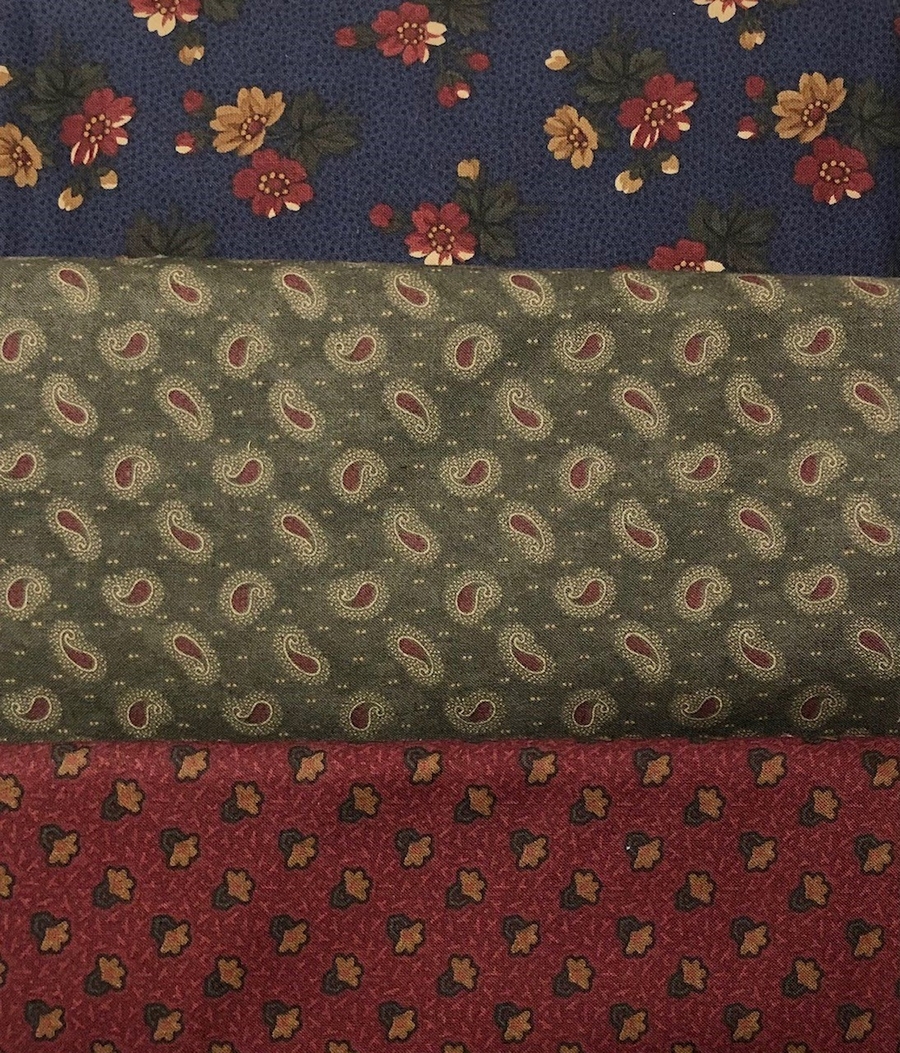
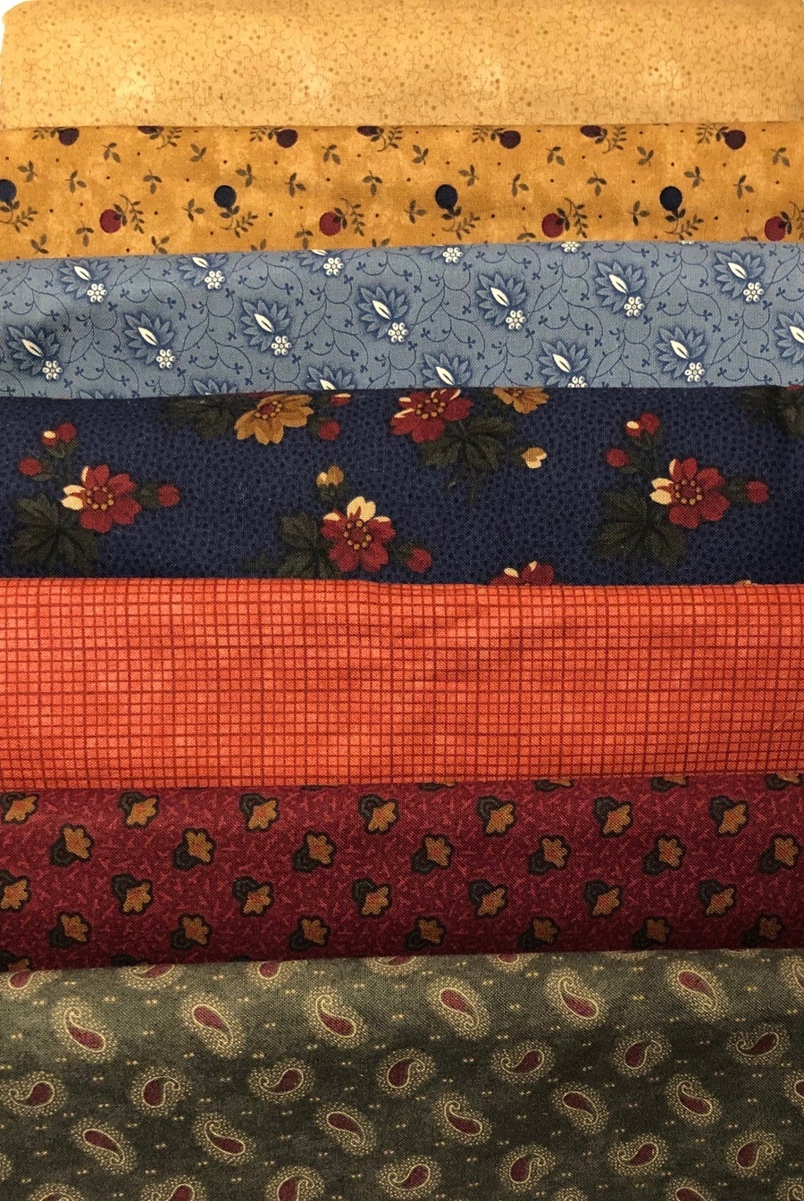
Selecting the right color is important, but if you only use colors that are the same value, your quilt will look flat and uninteresting. Value is the lightness or darkness of a color. When you add black to a pure color, fabrics are darker and are called shades. Add white to the pure color, and you get lighter values that are called tints. In quilt-speak, we think of fabric value as “light-medium-dark.”
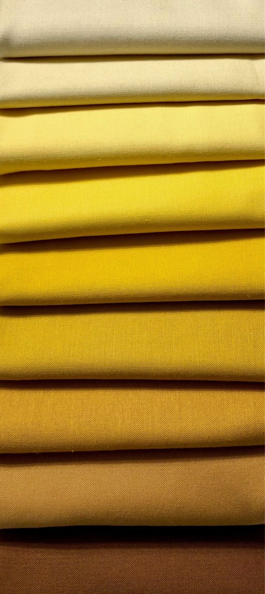
A successful quilt has all three values, which makes it look three-dimensional. Which of the two fabric piles below looks more exciting to you? Even though the colors “go together” in the first photo, they lack the spark that’s needed from adding a medium or light fabric to the group. With medium and light value fabrics in the mix, it looks much more exciting; the lighter values set off the dark fabrics instead of them looking muddy by themselves.
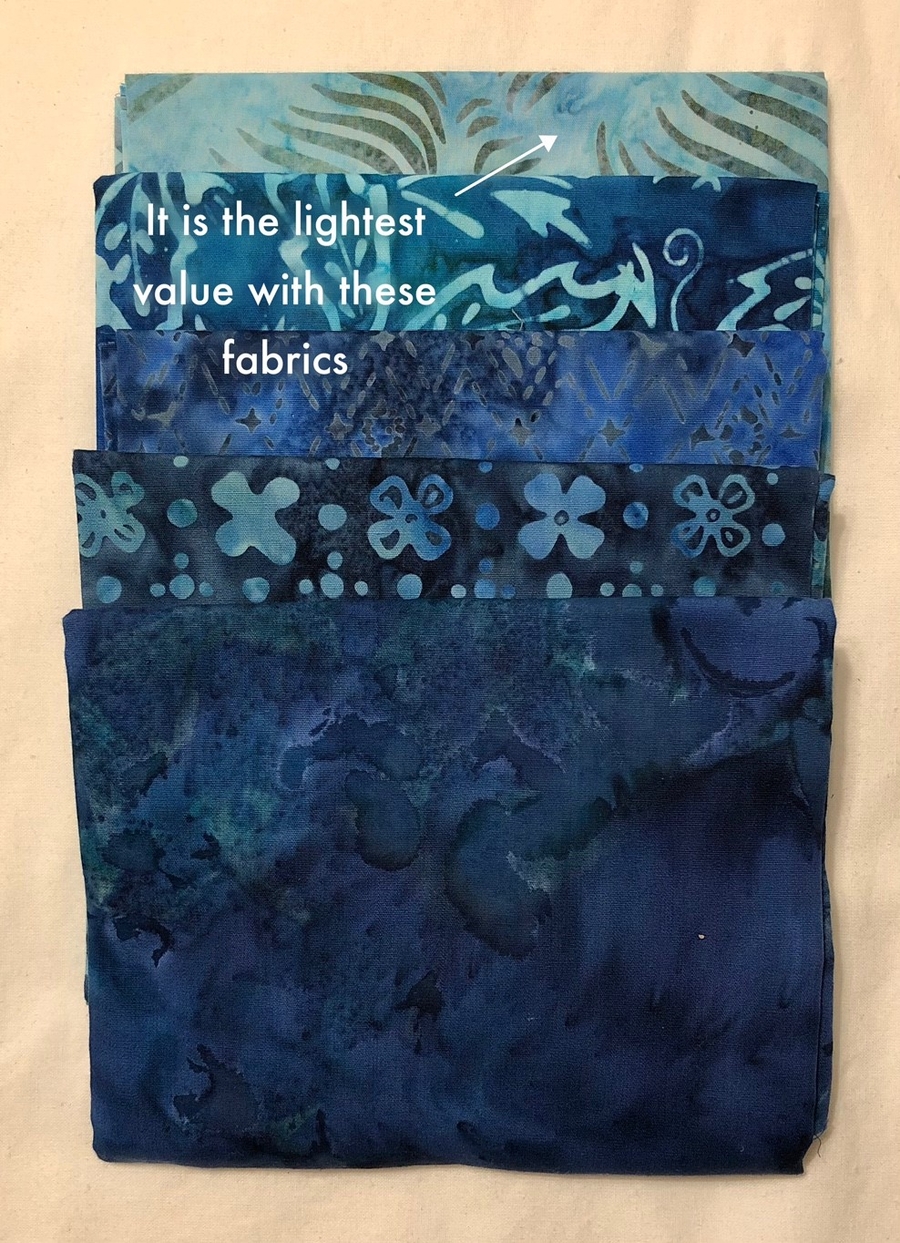
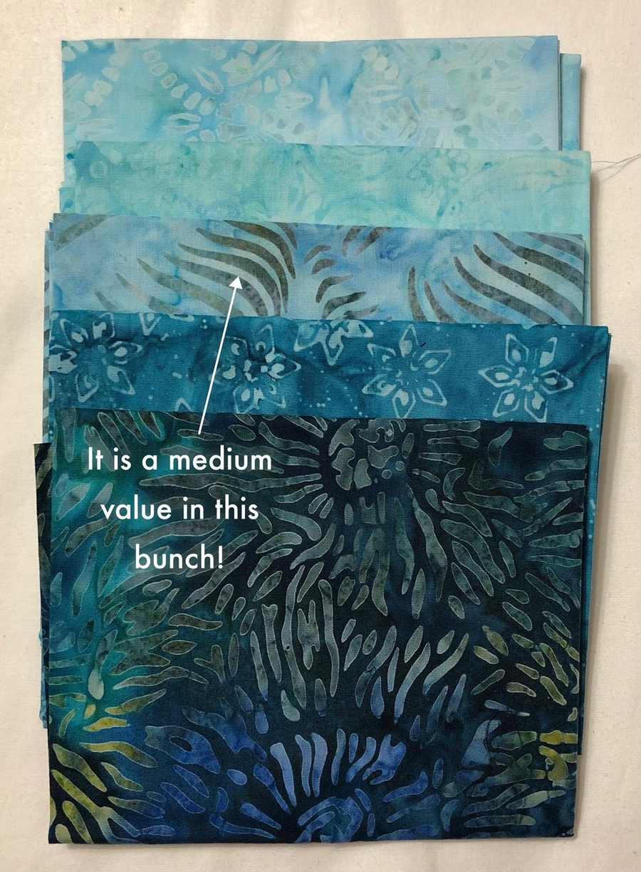
Value is also relative. A fabric’s value can change, depending on what fabrics are next to it. A fabric that is “light” in one grouping could be a “medium” in another. See how the light value fabric in the first group below becomes a medium value in the next group? When evaluating your fabrics, be sure to spread all of them out together to make sure you have different values for the most visual impact.
Analogous and complementary color schemes
When colors are right next to each other on the color wheel, they are called analogous colors. These neighboring colors always “go together”. Since they are very similar, they make a pleasing color combination that is successful, no matter what color family you choose. You’ll often see entire fabric lines that are analogous colors in varying values. Think red-orange-yellow.
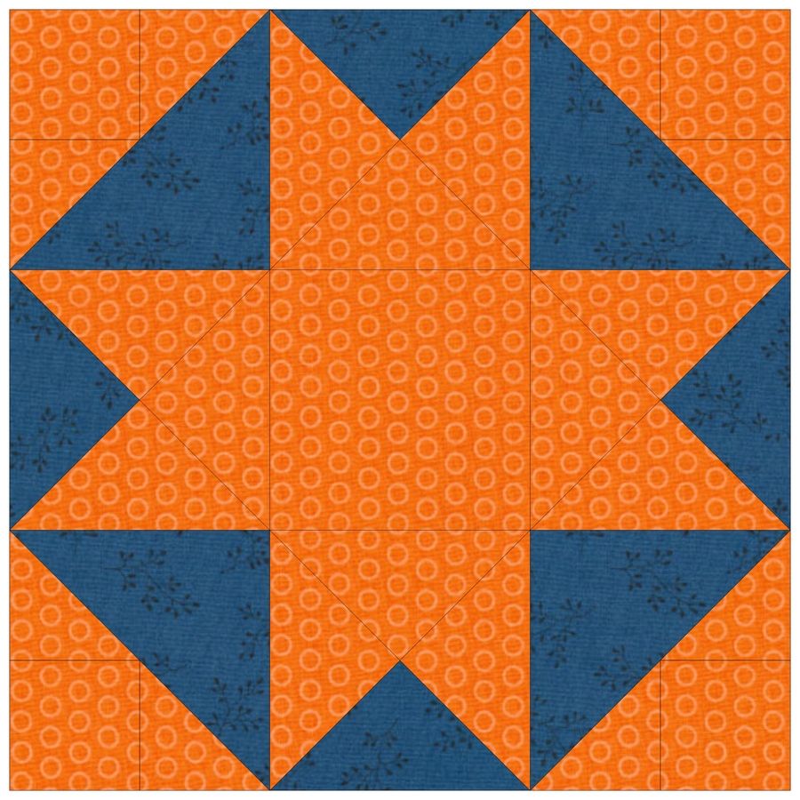
By contrast, complementary colors are opposite from each other on the color wheel. Quilts made from complementary colors are exciting and eye-catching. The eye sees contrast, but the colors also automatically work in harmony. The theory of “opposites attract” applies to quilts made with complementary colors! The secret to using them successfully is using them in unequal amounts. When they’re used in similar proportions, the contrast is so great that the eye has no place to rest, and the intended design is difficult to decipher.
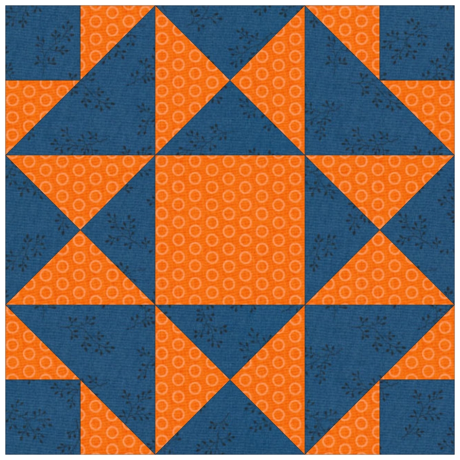
Use a lot of one color, and a little of the other. Otherwise, the contrast is too strong—like looking at a graphic stripe or plaid fabric that makes your eyes go crazy! In the block below, the orange takes charge.
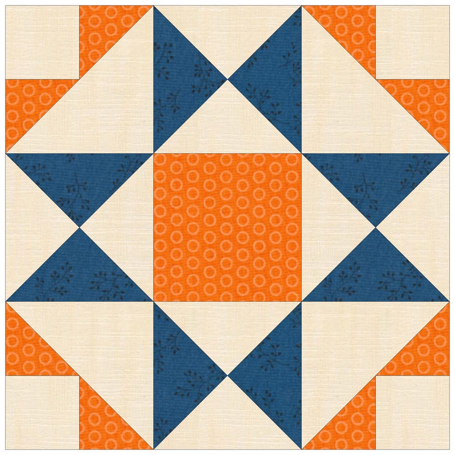
When you use complementary colors together, your quilt often looks better with a neutral background color. This softens the contrast between the two colors yet can intensify their impact.
Warm vs. cool
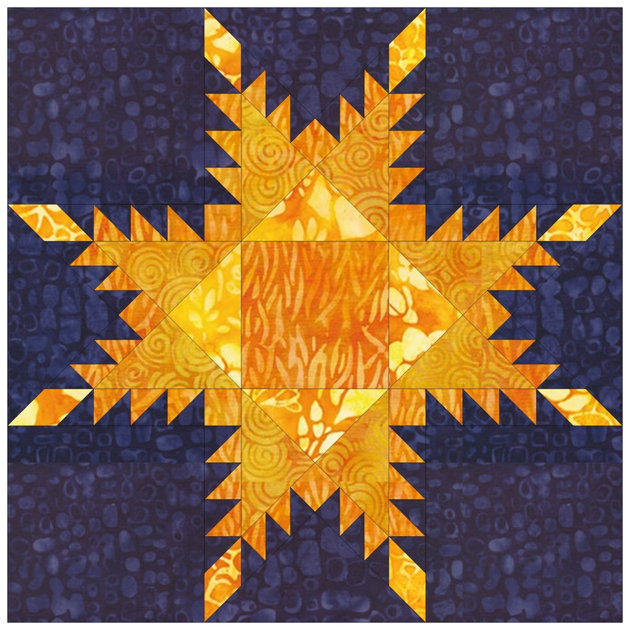
Warm colors will dominate a quilt and cool colors will recede into the background, no matter where you place them. The warm yellows make this feathered star beam like the sun, while the cool blue fades into the background. You can change the focus of your quilt by changing where you place warm and cool colors in your blocks.
This brief exploration of color and how it can impact your quilting designs just is just the tip of the crayon. Color theory extends far beyond the walls of your fabric shop—from paint chips at the hardware store to the garden center catalog. Shop the bookshelf at your local quilt shop for texts that dive deep into how color and fabric work together to make amazing quilts. Check out the art section in general bookstores—especially the shelves devoted to graphic design, where the books often showcase color palettes.
But no matter what a textbook tells you about color, the best information comes from your own heart—use fabrics that you love, that make you feel good, that inspire you!